Knead Token
A token under the Algorand blockchain
A token under the Algorand blockchain
Design Highlights
Knead token #1118456851 is a crypto token built under the Algorand blockchain.
Branding: This involves the creation of a new logo, logo assets from the created logo to represent the face of the brand, and, the creation of a color palate for the brand to help boost the brand's personality and promote brand awareness.
One month
(San Juan Argentina)
Visual Design
Brand Strategist
Color Theory
Brand Designer
Adobe Illustrator
Adobe Photoshop
Sketch Book
Discovery Session
Competitor Analysis
Competitor Analysis
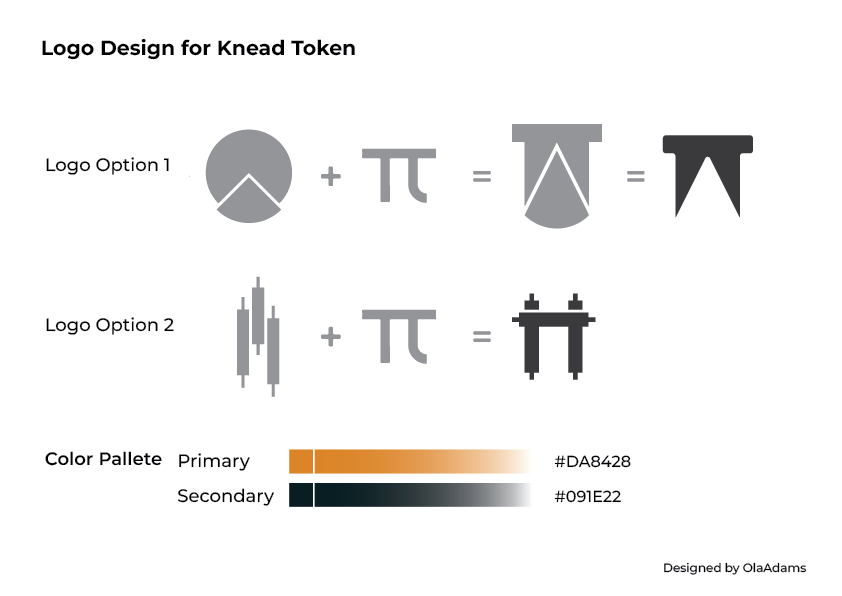
Sketching different Logo option
Moodboard
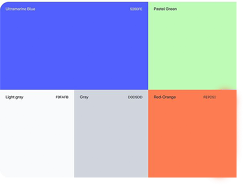
Brand Color Pallete
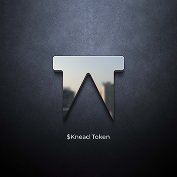
Designing Logo
Logo submission
Research
The discovery session is a critical phase in the design process, providing a comprehensive understanding of your brand’s essence and setting a strategic foundation for the project. Through in-depth discussions on the brand's purpose, pain points, competitive landscape, and target audience, we align our design efforts with your vision and goals. This thorough exploration ensures that the solutions we develop are not only aesthetically pleasing but also strategically effective in addressing your unique challenges and opportunities.
Research
A rigorous competitive analysis is crucial for understanding the landscape of similar projects built with the Algorand blockchain. By evaluating competitors’ features, performance, branding, and market positioning, I uncover valuable insights and identify opportunities for differentiation. This analysis not only informs the strategic direction of your project but also ensures that your solution stands out in a competitive market, leveraging best practices and addressing gaps to achieve success.
Ideation
In my ideation process for logo design, I start by thoroughly understanding the brand and its objectives. I begin sketching a range of initial concepts, exploring various shapes, styles, and compositions to capture diverse ideas. From these sketches, I refine the most promising concepts, experimenting with different styles and incorporating feedback. This iterative approach ensures that the final logo design not only aligns with the brand’s identity but also resonates with its target audience. By focusing on creativity and strategic refinement, I aim to deliver a logo that effectively represents the brand and meets client expectations.
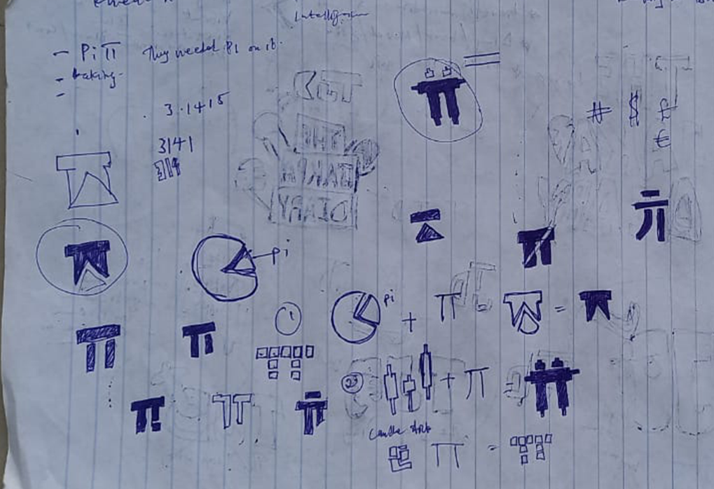
Ideation
I carefully curate these elements to capture the desired mood and tone, ensuring that they reflect the brand's personality and values. By organizing these visuals into a cohesive mood board, I can better communicate the aesthetic direction and conceptualize how different design elements will come together
Design
I begin by exploring a range of colors and shades that align with the brand’s vision and mission. This includes considering psychological effects of colors and their cultural significance to ensure they resonate with the intended audience. I also explore color harmony and contrast to create a visually appealing and effective palette.
Once I’ve narrowed down the color choices, I create a cohesive palette that includes primary, secondary, and accent colors. I ensure that the palette is versatile and works well across various applications, from digital to print.
Design
Once I have refined and selected the best sketch for a logo, I move on to the digital design phase using Adobe Illustrator. This is where I bring the sketched concept to life with precision and professionalism.
I start by setting up a new document in Illustrator and importing the sketched logo as a reference. Using the pen tool, I meticulously trace the sketch, ensuring clean and accurate lines. I pay close attention to details such as curves, angles, and proportions to capture the essence of the original concept.


Design
This phase is crucial for providing the client with all the necessary assets and documentation for effective use of the logo.
I start by preparing the final logo files in various formats, including vector files (AI, EPS) for scalability and high-quality prints, as well as raster files (PNG, JPEG) for web and digital use. Each file is optimized for different applications, ensuring that the logo looks sharp and consistent across all media.
I also create a logo package that includes different versions of the logo, such as color, black and white, and monochrome versions. This ensures that the logo is versatile and can be used in various contexts and backgrounds.
Finally, I share the complete logo package with the client using a Google Drive folder. This allows for easy access and download of all assets, ensuring that everything is organized and readily available for implementation.
"Hi Adam! Thanks to you for such a quality of work, it's worth much more! I hope we are a very low step of the success that awaits you! Thank you very much, my friend."